Create a basic Admin Page layout using flexbox
In this tutorial we will go over some of the very basics in creating an Admin Page layout that includes various optional headers.
For this example, we will be using Flexbox. Traditionally, aligning things vertically has been a challenge, but Flexbox makes it way easier. We will be going over some very basic concepts of flexbox in this tutorial, but if you want more indepth but still beginner friendly instruction, I recommend A Complete Guide to Flexbox.
I would also like to note that Tailwind and Bootstrap both have flexbox css classes that you could easily convert this example to.
Laying out the HTML
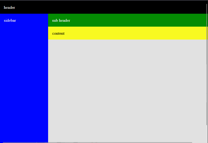
To start out, we need to layout the html in a structure. This structure needs to include:
- Header (optional)
- Sidebar
- Subheader (optional)
- Content
<div class="layoutHeader">
  header
</div>
<div class="layoutWrapper">
  <div class="layoutSidebar">
    sidebar
  </div>
  <div class="layoutContainer">
    <div class="layoutSubHeader">
      sub header
    </div>
    <div class="layoutBody">
      content
    </div>
  </div>
</div>
Adding Style to our Page
First thing's first. Let's remove any default padding and margins coming out of the base page and also tell it that we want it full height.
body,
html {
  height: 100%;
  margin: 0;
}
The body and html tags technically wrap our whole site, so we want to make sure that they are giving a good clean slate to work with. If you don't set the height to 100% then your page will get squished to be the height of whatever content you have on your page.
Header
.layoutHeader {
  width: 100%;
  background: black;
  color: white;
  padding: 1rem;
}
This gives the header a full width and will allow it to stack on top of the layoutWrapper div. This acts like a standard div in html/css.
The Layout Wrapper
.layoutWrapper {
  display: flex;
  /* uncomment below to move the sidebar to the right side */
  /* flex-direction: row-reverse; */
  /* stretches the height of everything below */
  align-items: stretch;
  /* ensures that the header is always at least full height */
  min-height: 100%;
}
This div is being used as a wrapping container for our sidebar and any content displayed next to the sidebar. We change the display to flex so that we can take advantage of flex box directional layouts.
Changing the flex-direction to row-reverse will move the sidebar to the right side.
align-items is another flexbox trick that tells all items to be stretched to the size of the layoutWrapper
Sidebar
.layoutSidebar {
  width: 200px;
  padding: 1rem;
  background: blue;
  color: white;
}
All the work is done in the Layout Wrapper so the sidebar acts like a normal div with a set width
Sub-Header and Content
.layoutContainer {
  display: flex;
  flex-direction: column;
  width: 100%;
}

.layoutSubHeader {
  background: green;
  color: white;
  padding: 1rem;
}

.layoutBody {
  /* uncomment below to make content full height */
  /* flex-grow: 1; */
  padding: 1rem;
  background: yellow;
}
The layoutContainer wraps the sub-header and the content and this time sets the flex direction to be column. This allows us to stack the sub-header and the content, while giving us additional flexbox tools.
If you add flex-grow: 1 to the layoutBody, you will see that it stretches the body content to be the full height and match the sidebar.
Playground
Try it out for yourself